Bristol City 24/25 Third O’Neills Kit

Bristol City 24/25 Third O’Neills Kit

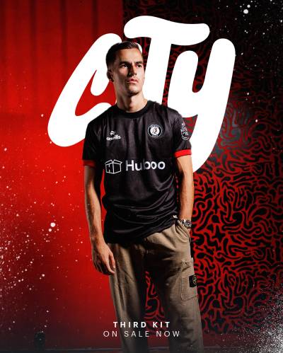
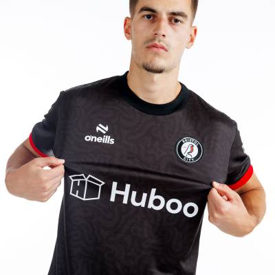
Bristol City Football Club (FC), of the EFL Championship, have unveiled their O’Neills 2024-25 Third shirt.

The new nominal-secondary-change release is in black with a subtle grafitti-style effect - referencing the culture of the city in England’s South West that the Robins are based in - and red and white embellishment as a nod to the first-choice colours.

Partner/sponsor logos are in white, sleeve cuffs are red, the crest takes in the whole palette and the kit is completed with matching black shorts and socks.

Sign in or create an account to earn points for voting, keep track of your reviews, edit them, and more.

View the: Bristol City 24/25 Home Kit

View the: Bristol City 24/25 Away Kit

Load More


3.3
56 ratings
Vote now!
  • 2
  • 1
  • 12
  • 14
  • 12
  • 8
  • 7
CSD
  • Member
  • 324
  • 6
  • 58
 · 5 months ago
Comment (Not Required)
Not bad, but I feel that they should've had the courage to show off the "graffiti" with vibrancy, especially since this is a third kit.
Show more
Poontang
 · 5 months ago
Comment (Not Required)
Nice clean design shirt. Its good to have red on it this time. Maybe red collar would have added better to it.
Show more
SIMON TEMPLER
 · 5 months ago
Comment (Not Required)
BLACK IS SO LAST YEAR
Show more
32c
 · 5 months ago
Comment (Not Required)
O neills branching out fae GAA
Show more
Razza
 · 5 months ago
Comment (Not Required)
Not bad, not good either
Show more
Red Cyril
 · 5 months ago
Comment (Not Required)
OK, why not red instead of white on the shorts?
Show more
 · 5 months ago
Comment (Not Required)
Ooh, I don't like it. It's black shirt with red on the sleeves, but it's somehow significantly worse than just a plain black shirt would have been.
Show more
Stab
 · 5 months ago
Comment (Not Required)
Just an overpriced black t-shirt. Zero effort gone into it.
Show more
Lexxxi
  • Member
  • 31
 · 5 months ago
Show more
Fløthe
  • Member
  • 598
 · 5 months ago
Show more