Join our community

Everton 2023-24 Hummel Third Kit

Everton 2023-24 Hummel Third Kit

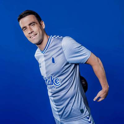
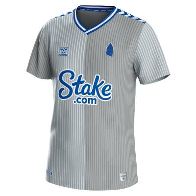
Everton's 23/24 Third kit has been revealed, brought to life by technical partner hummel, celebrating its 100th anniversary.

Drawing from hummel's iconic design, Everton's grey, blue, and white kit pays homage to the 'half-and-half' shirt worn by the Denmark national team during the 1986 World Cup.

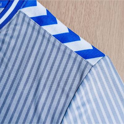
This marks Everton's return to a grey strip for the first time since 2017/18, featuring pinstripes that contrast ultimate and neutral grey tones against a white base and the classic Everton blue.

Sign in or create an account to earn points for voting, keep track of your reviews, edit them, and more.

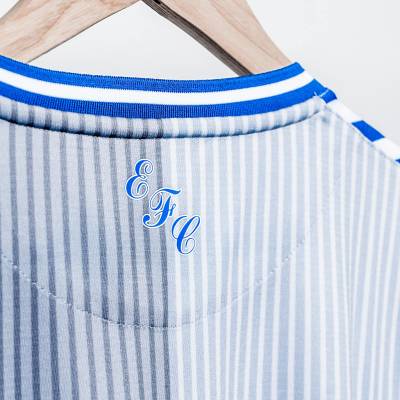
The V neckline and modernised shoulder chevrons highlight the vibrant blue accents. The Prince Rupert’s Tower logo stands out against the unique colour palette, replacing the traditional crest, alongside a retro 'EFC' logo on the outer neckline.

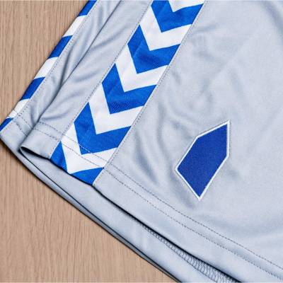
Completing the look are ultimate grey shorts with vertical blue and white chevrons, and ultimate grey socks featuring a blue, horizontal chevron trim.

View the: Everton 2023-24 Home Kit

View the: Everton 2023-24 Away Kit


5.1
52 ratings
Vote now!
  • 18
  • 11
  • 10
  • 5
  • 1
  • 2
  • 5
Above Average
Exit the Lemming
 · 1 year ago
Loses much of its appeal at a distance but decent
Show more
Above Average
Fuascailt
 · 1 year ago
The badge is wack
Show more
Masterpiece
Stakey
 · 1 year ago
Simple but really nice, even tho Hummel have milked the design for all it’s worth.
Show more
  • Watching in 2023 1 year ago
    100% agree withthe last bit
Average
Sam
 · 1 year ago
Too many teams across the football world wearing this design. It's not bad but not original. In fact one of the best versions of this Hummel design was Aston Villa a few years back.
Show more
Masterpiece
Piemelaar
 · 1 year ago
Great kit to relegate.
Show more
Average
Bill Borkle
 · 1 year ago
Would have been better in the colour of the away kit. Who honestly needs a third seriously, other than the marketing people? This would be much better if it had a proper badge and not the marketing gimmick of the stylised tower.
Show more
Above Average
JK
 · 1 year ago
Club badge is shocking
Show more
Masterpiece
Treeman Tony
 · 1 year ago
I love it! Great retro design which is brought to life with the colour scheme. Look forward to seeing it during the season.
Show more
Below Average
CSD
 · 1 year ago
Jammies
Show more
Hall of Shame
BullS
 · 1 year ago
Would you get rid of that Temu pop up advert. It’s worse thing on here and that’s saying something given how awful some Prem 3rd kits can get.
Show more
No results

Loading...