Join our community

Leeds United 24/25 Adidas Away Kit

Leeds United 24/25 Adidas Away Kit

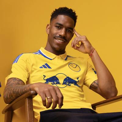
Leeds United and adidas have unveiled their new away kit for the 24/25 season.

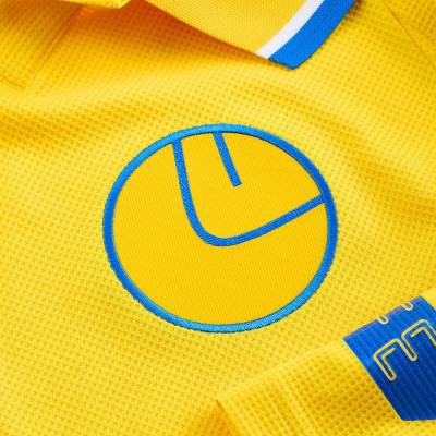
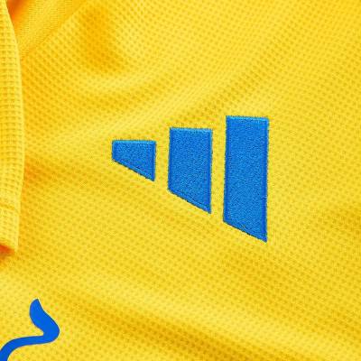
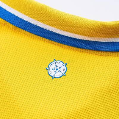
Drawing inspiration from the 1974 shirt, this yellow jersey showcases the smiley badge from that era. The design includes a unique blue-tipped button-up collar and adidas's signature three stripes in split blue and white along the shoulders.

The kit is completed with matching yellow shorts and socks, featuring blue taping and LUFC script.

Sign in or create an account to earn points for voting, keep track of your reviews, edit them, and more.

View the: Leeds United 24/25 Home Kit

Load More


5.4
171 ratings
Vote now!
  • 81
  • 38
  • 16
  • 7
  • 5
  • 4
  • 20
Masterpiece
Brett Simons
 · 8 months ago
Superb Kit
😍
Show more
Masterpiece
England's rusty cup
 · 8 months ago
Yes YRA, I wet myself.💦
Show more
Masterpiece
Raploch Billy
 · 8 months ago
Magic!
Show more
Good
MrTito
 · 8 months ago
It pains me to say it, but that is a delicious kit

(worn by a horrible team)
Show more
Good
Shaun
 · 8 months ago
Considering how boring the home kit is, this one is really well done
Show more
Masterpiece
Eric Cantaloupe
 · 8 months ago
C'est magnifique!
Show more
Masterpiece
YRA
 · 8 months ago
We all hate Leeds ... but i know Leeds fans will wet them selves over that kit even forgiving the sponsor on it . Great piece of work by LUFC and Adidas ... that badge is a work of genius ..if you grew up in these parts in late 70s youll know .. and i hate Leeds ****
Show more
Masterpiece
CH
 · 8 months ago
It's finally yellow. And it's got the Smiley back. Nigh on perfect.
Show more
Bad
rigger
 · 8 months ago
Nope.
I don't get why everyone's raving about this shirt.
The collar is horrible, like some Fred Perry knock-off.
I hate polo shirt style football kits - they belong on a golf course or the tennis court.
The smiley is way too big.
The collar.
The sleeve stripes are too much, they overpower the look especially either with the sleeve sponsor or without - that gap is just as overpowering.
The collar.
Did I mention the collar ?

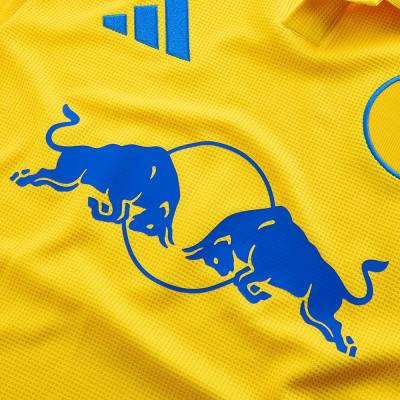
I LOVE that they've changed the Red Bull logo.
If they'd done that on the home shirt as well then I would be over the moon.
The colour is fine.
I would've preferred a v-neck, the adidas trim stripes down the sides under the arms, leaving the shirt itself as plain yellow.
If they'd done those things and used a smaller smiley it would be perfect.

As it is, I think it looks like a Primark summer shirt for ageing lager louts ...
Show more
  • Ra 8 months ago
    You know nowt, ar kid
Masterpiece
Leeds scum
 · 8 months ago
I think we can agree that we all hate Leeds and Leeds and Leeds, Leeds and Leeds BUT they have got everything right from the shade of yellow and blue to the white in the adidas stripes and the badge and even getting the sponsor to be blue. Hats off. But it in no way makes up for the lifelong shame of the person (J) who thought the fist badge was a good idea.
Show more

People

Nature

Symbols

Food

Flags