Wolves 16/17 Puma Home Kit

This is the new Wolverhampton Wanderers FC 16/17 Home football kit by Puma.

The shirt has a retro style to it and features pin stripes to the front, which were last seen on Wolves home shirts in the 1980’s.

100%polyester with a mesh under arm detail. Stylised rib collar with self fabric insert. Puma T7 shoulder panel and ribbed cuffs. Double stitched hem and seams.

Sign in or create an account to earn points for voting, keep track of your reviews, edit them, and more.


Write comments...
You are a guest ( Sign Up ? )
or post as a guest
Loading comment... The comment will be refreshed after 00:00.
  • This commment is unpublished.
    Not a royal · 8 years ago
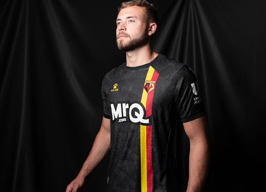
    I know there's been some anger in Wolverhampton around the choice of sponsor, but that aside (and ignoring the fact the yellow bar makes the sponsor logo appear to be too high) it's a fairly lovely kit. It does look a little more like a Hull City kit on first glance (what with the pin stripes) but guessing those pin stripes might bring back some fond memories from those who were following them in the 80s.
  • This commment is unpublished.
    Mapleleaf · 14 years ago
    Illustrator and Photoshop
  • This commment is unpublished.
    Guest · 14 years ago
    how do you make these
  • This commment is unpublished.
    Guest · 14 years ago
    for the collar look at some of the cantabury rugby shirts or think newcastle 96 shirt, but with less buttons.
  • This commment is unpublished.
    Guest · 14 years ago
    The stripes need to go all the way down the shirt, imagine if this were to be tucked in, the stripes would barely be visible! Compared to your Liverpool designs, this isn't anywhere near as good. Sorry :sad:
  • This commment is unpublished.
    bastien · 14 years ago
    I quite like this, the shade of blue doesn't disturb me anymore for it is the same than on the crest. But I really don't like this collar...
  • This commment is unpublished.
    Mapleleaf · 14 years ago
    Can you provide a link to a puma shirt with a collar like that please?
  • This commment is unpublished.
    Guest · 14 years ago
    its ok, but its not the toon. it has to be simple black & white stripes. not many fans would like this in my opinion, but its a good try. the collars good, but puma have been using this collar for at least 3 seasons now. try maybe using a open grandad collar style like some rugby shirts.
  • This commment is unpublished.
    Mapleleaf · 14 years ago
    What do other people think of the collar?
  • This commment is unpublished.
    Guest · 14 years ago
    Nice i like it :-)
  • This commment is unpublished.
    MW FROM WIDEOPEN · 14 years ago
    this is awful, there is far too much black on the shirt, the shade of blue is awful and that collar is horrible. The yoke template that youre using here has no place on a Toon top, it should be black and white all the way