Watford 2020-21 Kelme Home Kit

Watford 2020-21 Kelme Home Kit #watfordfc #Watford #kelme

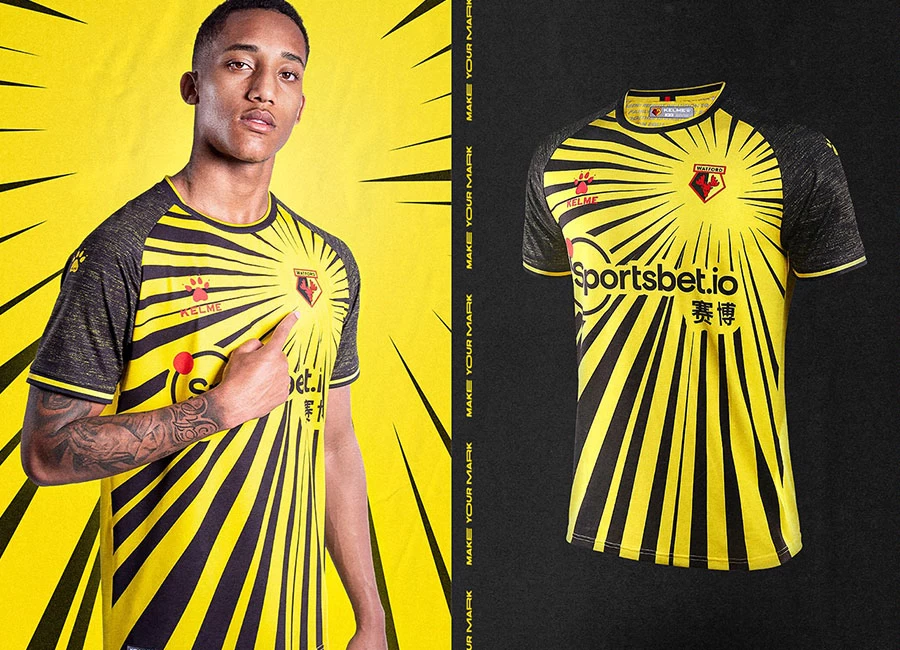
Watford FC revealed their new home kit for the 2020/21 season.

Featuring a bold and bespoke design, this striking strip is the first to be produced exclusively for the Hornets by the club’s new technical partner Kelme.

Shop Watford Shirts

Sign in or create an account to earn points for voting, keep track of your reviews, edit them, and more.

Fans will wear the exact same jersey as those worn on the pitch by the players. Highly breathable, polyester spandex, cool dry fabric helps keep sweat off your skin, so you can stay cool and comfortable on the pitch or in the stand.

View the: Watford 2020-21 Away Kit

View the: Watford 2020-21 Third Kit

{minipolls id="watford2020homejersey" title="What do you think?"} Masterpiece|| Good|| Above average|| average / Nothing special|| Below average|| Bad|| Hall of shame {/minipolls}


Write comments...
You are a guest ( Sign Up ? )
or post as a guest
Loading comment... The comment will be refreshed after 00:00.
  • This commment is unpublished.
    Luton Hornet · 4 years ago
    @Kenilworth the Cat My word! You're pulled it off again. You really do have a way with semiotics.

    Hatters off!
  • This commment is unpublished.
    Kenilworth the Cat · 4 years ago
    Joke shirt for a joke club. It will become known amongst yellow bellies as ‘the relegation to league one’ shirt’.
  • This commment is unpublished.
    rigger67 · 4 years ago
    This is a rip-off of a classic Kaiser Chiefs shirt from about a decade ago. Theirs was a richer, golden yellow with pure black and had much chunkier "beams" emanating from the badge.
    Watford's, by comparison, looks like a washed-out photocopy of the original and is awful anyway but much, much worse if you know the shirt that inspired it.

    Shoddy tribute shirt.
  • This commment is unpublished.
    Kenilworth the Cat · 4 years ago
    Perfect kit for the trophyless ones/Udinese B....
  • This commment is unpublished.
    Edwin D. Large · 4 years ago
    @Luton Hornet You really do have a way with words. It’s ‘You’ve’, smart arse.
  • This commment is unpublished.
  • This commment is unpublished.
    Ew gross · 4 years ago
    That’s awful. Deserve to get relegated again just for wearing this
  • This commment is unpublished.
    Hermione Yaxley-Lennon · 4 years ago
    @Kenilworth the Cat Homophobic as well as pathologically racist.

    Super.
  • This commment is unpublished.
    Kenilworth the Cat · 4 years ago
    @Luton Hornet Yeah you’d love oscar wilde in your parlour wouldn’t you? ;););)
  • This commment is unpublished.
    Luton Hornet · 4 years ago
    @Kenilworth the Cat I believe Oscar Wilde has just entered the parlour.
  • This commment is unpublished.
    Malky · 4 years ago
    Great kit, but I have to agree with a previous comment of maybe a bit of red somewhere would be nice even if it was just the numbers.
  • This commment is unpublished.
    Dicky · 4 years ago
    @rigger67 I can't recall Ricky Wilson and the boys wearing a shirt like this......
  • This commment is unpublished.
    Russel1311 · 4 years ago
    Boom! Love it, why not. People moan about the boring ‘simplistic’ designs, this is striking and different. In a world of Nike/Adidas domination, nothing else looks like this. Also good to see Kelme breaking into English football.
  • This commment is unpublished.
    WATPGhost15 · 4 years ago
    Horrible and Made in China kit... Watvirusford.
  • This commment is unpublished.
    Togga2112 · 4 years ago
    Oh boy! I really hope Watford draw Port Vale in the cup. That would be migraine inducing
  • This commment is unpublished.
    BaddersTUFC · 4 years ago
    Embarrassingly bad. They deserved to be relegated if they are going to keep coming out with these horrid versions of a Burton Albion kit.

    I'm not even a Watford fan but how I hanker for the days when they wore yellow and red in the days of Elton John and Graham Taylor.
  • This commment is unpublished.
    Tractorman · 4 years ago
    Wow. That's really, really awful. Shockingly bad.
  • This commment is unpublished.
    Anders · 4 years ago
    Quite like this, its a bit noisy with the sponsor on top but at least it’s a bit different, what’s bugging me though is that the badge seems to be a little off to the left of where it should be
  • This commment is unpublished.
    Ross Jenkins · 4 years ago
    Relegation did not leave them in good stead. Kit designers gone mad!
  • This commment is unpublished.
    It333 · 4 years ago
    IS A BIG COMPETITION WITH THE DORTMUND KIT.
0.5
1 rating
Vote now!
  • 0
  • 0
  • 0
  • 0
  • 0
  • 0
  • 1
Togga2112
  • Member
  • 1
  • 24
 · 4 years ago
Comment (Not Required)
Oh boy! I really hope Watford draw Port Vale in the cup. That would be migraine inducing
Show more
Der K
  • Member
  • 1
  • 108
 · 4 years ago
Comment (Not Required)
Atrocious.
Show more
B
 · 2 years ago
Comment (Not Required)
Joke joke joke joke, just like Joao Pedro - a joke
Show more